
13/05/2025
Share:
13/05/2025
Share:
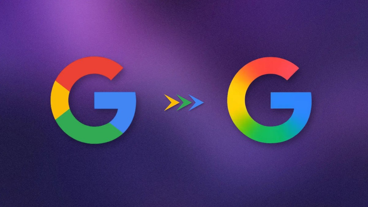
NEW YORK, May 13: In recent days, some keen-eyed Google users may have noticed a subtle update to the company’s logo. In select instances, the well-known capital "G" now includes a gradient that softens the transition between its four solid-color sections. This updated branding is visible on the Google app for both Android and iOS devices. However, the classic color block logo remains in place in several other locations, including browser favicons, and it is still featured in Google’s official press images.
Notably, other Google smartphone app logos have not yet adopted this new gradient design. However, the branding for Google's Gemini AI assistant includes a slight gradient effect on its star symbol. This could suggest that AI is influencing not only Google’s technical decisions but also its visual design. Alternatively, this could be a test to gauge user reactions before the company rolls out a larger brand overhaul.
What stands out most about this logo update is the lack of fanfare. When Google last refreshed its branding in 2015, it came with an extensive campaign explaining every aspect of the new look. Considering the importance of branding for a company as large as Google, even the smallest changes typically generate significant attention.